Promotional Banner
About the Project To promote Six Hundred Four’s Chinese New Year sale, a series of window decals were designed to attract the attention of passersby during the festival. A central pattern, inspired by traditional Chinese coins and accented with peach blossoms to reflect the festive season, was developed around the brand’s logo. Elements of this pattern were then selectively applied across multiple decal designs to create visual variation while maintaining a cohesive overall system. The red vertical banner features the phrase “步步高升”, meaning “May every step take you higher”, a sentiment chosen for its relevance to a sneaker store. At the base of the banner, a stylized cartoon pig, representing the Year of the Pig, is depicted wearing sneakers to reinforce the brand connection. For the horizontal window decals, the phrases “Happy New Year” and “Wish you success in everything,” two commonly used Chinese New Year greetings, were placed along the top edges of the window panes. Ultimately, while the full suite of designs was well received by the client, production constraints resulted in only the larger vertical banner being fabricated and installed. Responsibilities Concept | Illustration | Graphic Design
Read More ›

Site & Storefront
About the Project Pet Craft Supply Co. is a pet product brand offering quality goods at accessible price points. I was responsible for designing and developing both the brand website and its Amazon Storefront. The goal was to establish a more refined and premium digital presence for Pet Craft, distinguishing it from other more budget-focused pet brands under the same parent company. Rather than limiting the site to a simple landing page linking out to Amazon, I proposed expanding it into a browsing experience for users discovering the brand outside of Amazon. The final direction aligned the website closely with the Amazon Storefront, resulting in a unified experience across both platforms. I designed a minimal grid-based layout to support clear product hierarchy and easy browsing. Select best-selling products were highlighted with lifestyle imagery to strengthen visual appeal and encourage engagement. Responsibilities Images: Styling | Photography (with limited use of stock imagery) | Photoshop (isolation and retouching) Amazon Storefront: Layout | Graphic Design Website (Squarespace): Layout | Graphic Design | Custom CSS Development Additional Initiatives: Photoshoots: Due to a lack of suitable lifestyle imagery in the company’s existing archives, I independently organized and directed photoshoots using my own dogs and those of […]
Read More ›
Promotional Postcard
About the Project For potential brand and artist collaborations with Six Hundred Four, I designed a promotional postcard that communicates the brand’s identity and offerings in a clear, accessible format. The goal was to create a concise piece that quickly conveys key information while encouraging further engagement from prospective collaborators. Responsibilities Photography: Shot and styled all images except the 2nd and 4th back-panel photos Graphic Design: Layout | Typography | Visual styling
Read More ›

Brand Identity: Instagram Feed
About the Project As Brand Experience Manager for Six Hundred Four (SHF), a Vancouver-based limited-edition sneaker brand, I was responsible for developing the brand’s visual presence on Instagram, its primary social media platform. Given the brand’s strong emphasis on storytelling, the focus extended beyond individual posts to the overall composition and narrative flow of the feed. In the lead-up to the website launch, I designed a series of teaser posts released over several weeks to introduce upcoming product drops. The initial 9-post grid formed the shape of the brand’s logo, populated with silhouettes of select sneakers, offering a first look while maintaining a level of visual concealment. Subsequent rows gradually revealed additional details of individual products, transitioning from abstract forms to clearer product visibility. Across ongoing artist collaborations, each collection was presented with its own distinct visual language while maintaining overall feed cohesion, allowing each release to feel unique while remaining part of a unified brand system. Responsibilities Photoshoots: Art direction | Styling | Photography Imagery: Graphic design | Conceptual planning
Read More ›
Email Newsletter
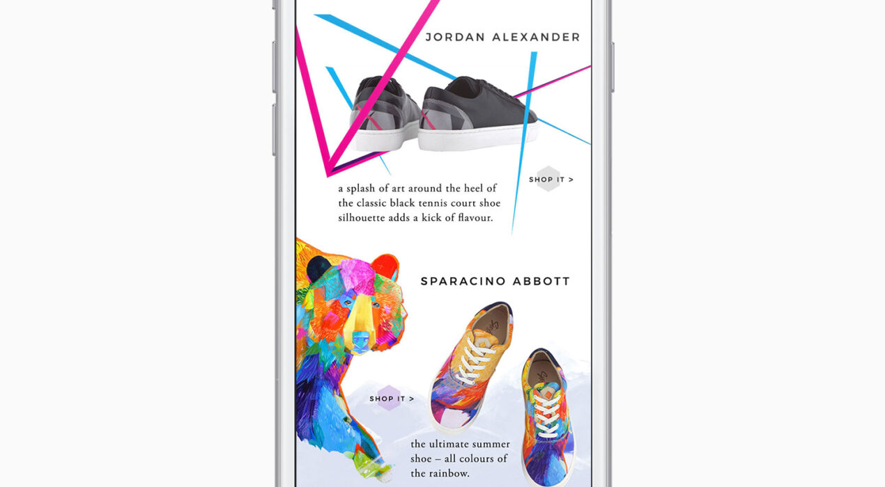
About the Project One of several email marketing campaigns created for Six Hundred Four, this campaign highlights the brand’s Summer Picks selection of four featured sneakers. The design presents a cohesive showcase of selected products through a structured, scroll-based layout. Artwork elements from each sneaker were isolated and used within their respective product sections to reinforce a cohesive, section-specific design system.
Read More ›