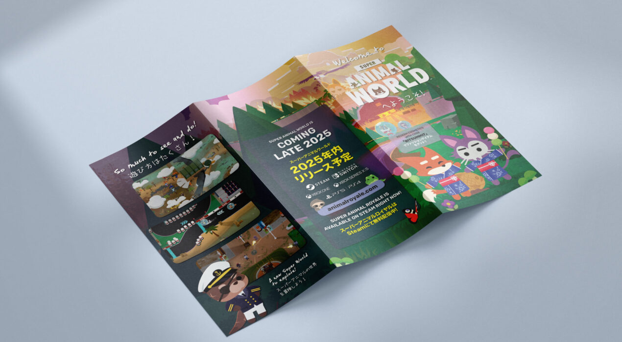
Bilingual Brochure
Brochure distributed at BitSummit, Japan’s leading independent game development festival held annually in Kyoto. Pixile Studios showcased Super Animal Royale and its upcoming expansion, Super Animal World, with a booth at this year’s event. The brochure was designed as a travel guide to invite attendees to Super Animal Island, highlighting its key activities and attractions. It was produced in both Japanese and English to accommodate local attendees as well as international visitors.
Read More ›
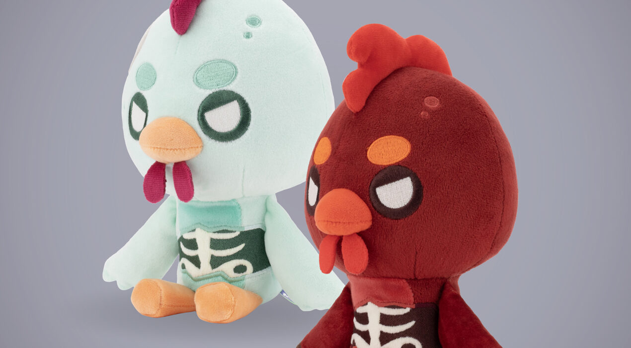
Plushies – Zombie Joes
About Built on prior collaborations with Makeship to launch two plush characters from Super Animal Royale’s “Bwoking Dead” mode as part of their Halloween “Menace” event. Led product design from concept through production. Full project details available upon request. Responsibilities Product: Design direction Photoshoots: Directing | Styling | Photography Marketing Imagery: Graphic Design | Conceptual Planning Schematics
Read More ›
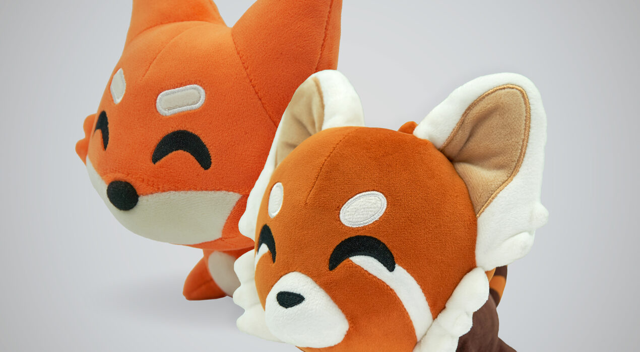
Magnetic Plushies
About As Merchandising Manager at Pixile, I led the design of all branded merchandise, including collaborations and partnerships with external brands. Collaborated with Youtooz to bring two Super Animal Royale characters to their “Shoulder Rider” plush line, balancing brand adaptation with silhouette fidelity through iterative prototype feedback. Also developed the concept and design for a bonus in-game gift-with-purchase. Full project details available upon request. Responsibilities Product: Design direction Photoshoots: Directing | Styling | Photography Imagery: Graphic Design | Conceptual Planning Schematics
Read More ›
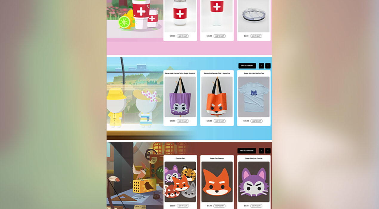
Super Merch Shop
About Developed and created the website for Pixile Studio's Super Merch Shop, an online store of in-house merchandize for the game Super Animal Royale, based on the style guide for SAR's branding and illustrations created by SAR's artists. Designed and manufactured all in-house products, including product and mailer packaging, for the Super Merch Shop. Also photographed or created all product images.
Read More ›
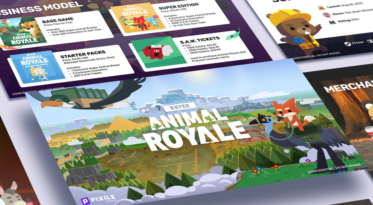
Presentation Design
Designed Keynote presentation decks for Super Animal Royale for both public presentations and private business meetings. Emphasized strong visual hierarchy and brand consistency while ensuring each slide remained visually compelling.
Read More ›

Promotional Banner
About the Project To promote Six Hundred Four's Chinese New Year sale, new window decals are designed to catch the eye of passersby in this festive season. A pattern, inspired by traditional Chinese coins with peach blossom accents to represent the popular festival, is first created around the brand's logo. Then parts of the pattern are then strategically used on the different decals so they look distinct but still coherent at the same time. "步步高升" on the red vertical banner decal is a CNY phrase that means "May every step take you higher", which I found to be the most fitting phrase that we could use for a sneaker store. The cartoon pig at the bottom of the banner, representing the Year of the Pig, is also wearing sneakers for emphasis. For the horizontal window decals, "Happy New Year" & "Wish you success in everything" (the two most widely and commonly used CNY phrases) line the top edge of the top panes. Ultimately, although the founder loved all the designs, several setbacks only allowed us to put the larger vertical decal into production and display. Responsibilities Concept | Illustration | Graphic Design
Read More ›

Site & Storefront
About the Project Pet Craft Supply Co. is a new pet product brand that sells quality pet products at affordable prices. I was tasked with building the brand's website and Amazon Storefront. As Pet Craft shares a parent company with some other more affordable pet product brands that are sold through Amazon, I wanted to create a more distinct and deluxe look for the more premium brand name. Instead of the original plan of having a simple landing page with a link to Pet Craft's Amazon Storefront, I proposed for the website to include products for customers who find the brand through other means outside of Amazon. It was then decided that the website will mirror the Amazon Storefront, so I went with a minimal grid layout that will work well on both sites and allow customers to browse through products easily. Select bestselling products are highlighted with lifestyle photos to entice customers to click on the products. Responsibilities Images: Styling | Photography (minus a few stock images) | Photoshop (isolations & touchups) Amazon Storefront: Layout | Graphic Design Website: Layout | Graphic Design | Custom CSS Coding (Squarespace) Additional role(s) I've taken initiative of: Photoshoots: Due to the lack of usable product […]
Read More ›
Promotional Postcard
About the Project For potential brand and artist collaborations with Six Hundred Four, I created a promotional postcard that summarizes what the brand is about and what we do, that is quick and easy to understand and entices the potential partnering brand or artist to want to know more. Responsibilities Photos: Apart from 2nd and 4th photo on the back of postcard, all images are photographed and styled by me Graphic Design: Styling | Layout | Typography
Read More ›
Loafie+Doughy Stickers
About the Project In anticipation of a new brand and website for Corgis Loafie and Doughy, I've made some stickers to be distributed and put up as the first products on sale for the brand.
Read More ›


